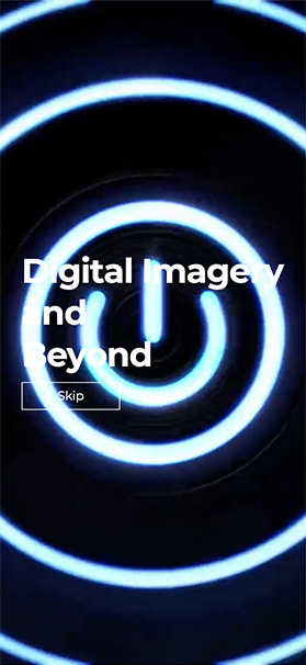
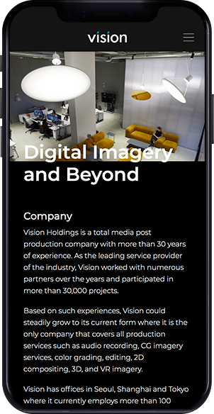
DIGITAL IMAGERY
AND
BEYOND
Branding
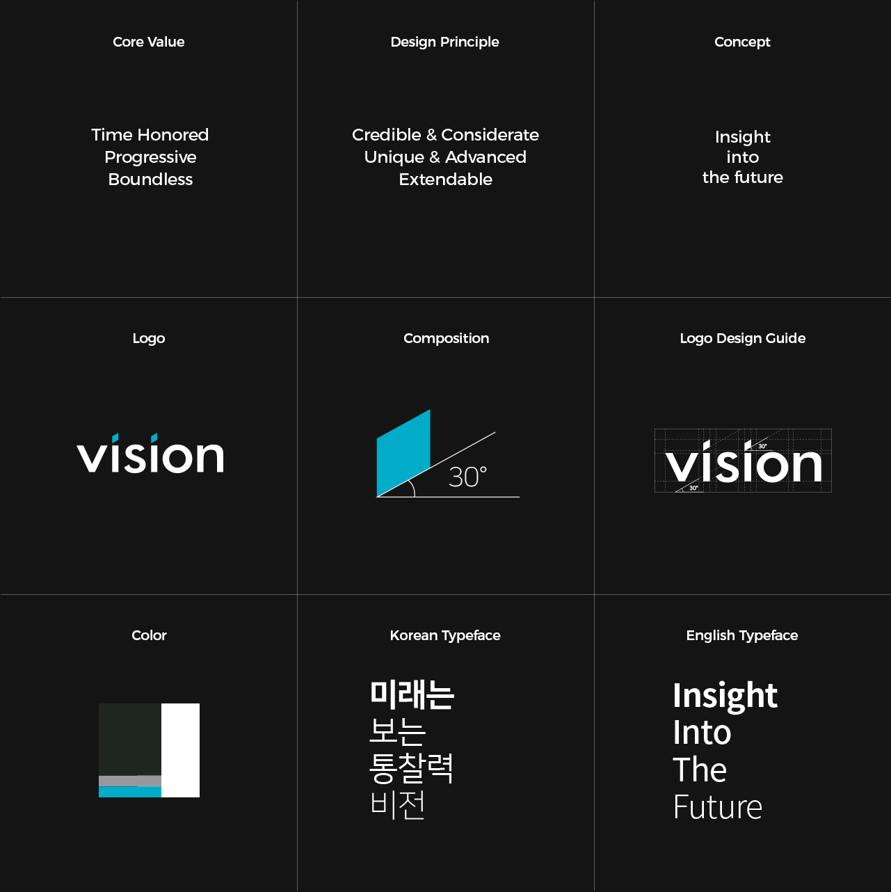
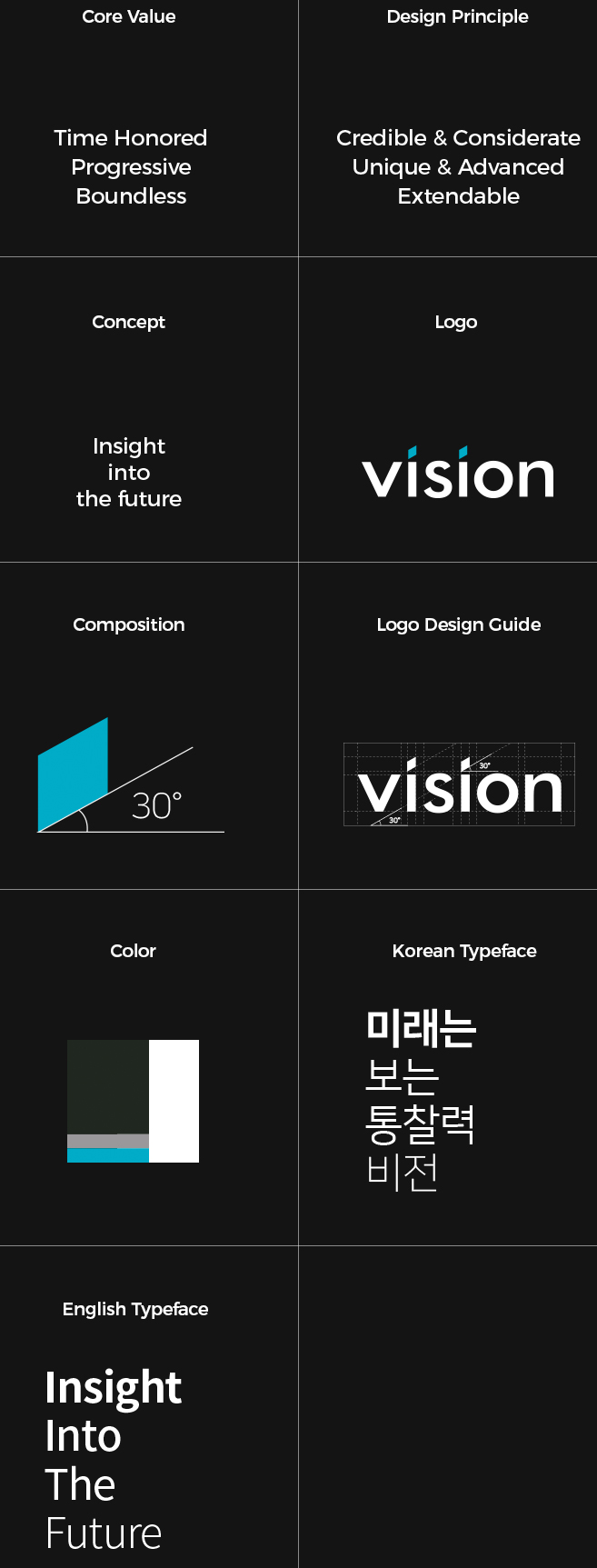
Vision의 신규 로고는 소문자를 활용하여 기존의 무겁고 다가가기 어려운
이미지를 벗어나 소비자에게 친근하고 가까운 이미지로 부각됩니다.
기존에 원으로 표현되는 소문자 ‘i’의 점은 색다른 모양과 컬러로 표현하여
포인트를 줬습니다. 이는 Vision의 끊임없는 도전정신과 창의력을 뜻합니다.
공간감이 느껴지도록 비틀어서 표현한 평행사변형은
기존 평면 속에서만 보는 영상을 넘어 새로운 장르, 공간 그리고 영역을
넘나들며 정복해가는 Vision 깃발의 의미를 담고 있습니다.
30도 각도는 30년이 넘는 우리의 역사와 초심을 절대 잊지 않겠다는
의지를 담았습니다.
Basic System
Project Goal
Considerate
Advanced
into
the future
Logo
공간감이 느껴지도록 비틀어서 표현한 평행사변형은 기존 평면 속에서만 보는 영상을 넘어
새로운 장르, 새로운 공간, 새로운 영역을 넘나들며 정복해가는 깃발의 의미를 담고 있습니다.
30도 각도는 30년이 넘는 우리의 역사와 초심을 절대 잊지 않겠다는 의지를 담았습니다.
Color
비전은 위엄있고, 전통적이며 고급스러운 이미지를 지향합니다.
올드한 느낌에서 벗어나 스마트하고 새로운 느낌을 자아내기 위해
민트와 그레이 컬러를 조화롭게 사용하였습니다.
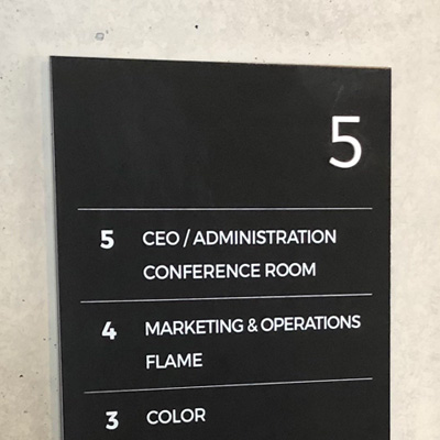
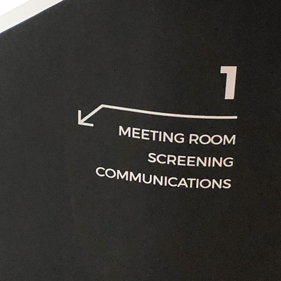
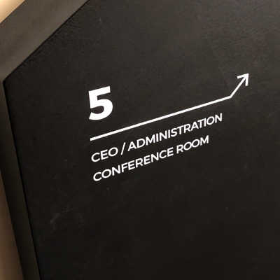
Signage
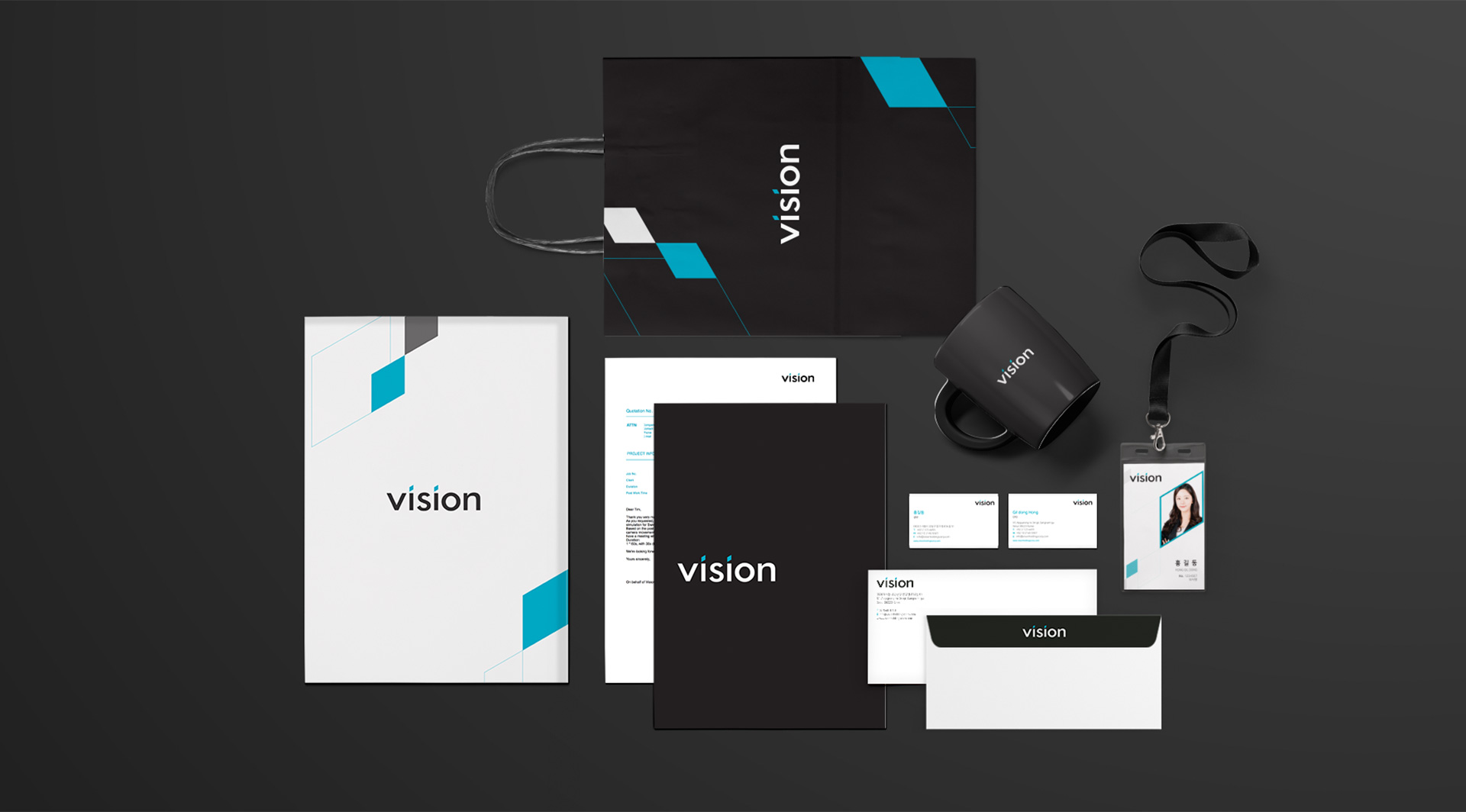
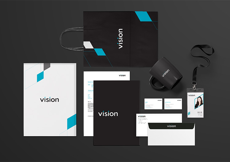
Application
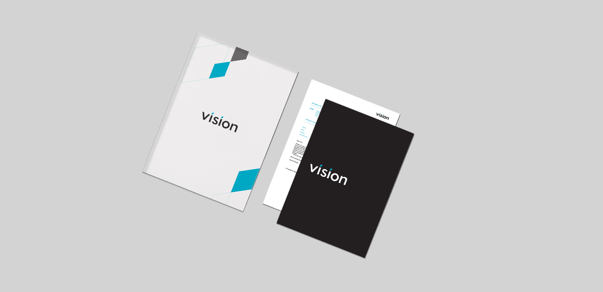
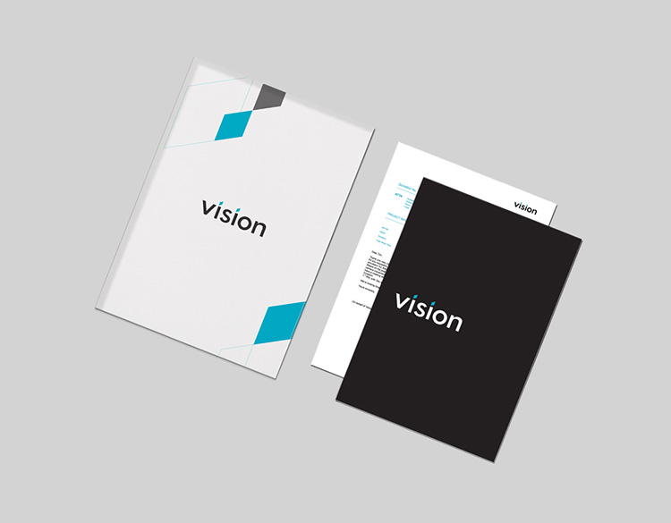
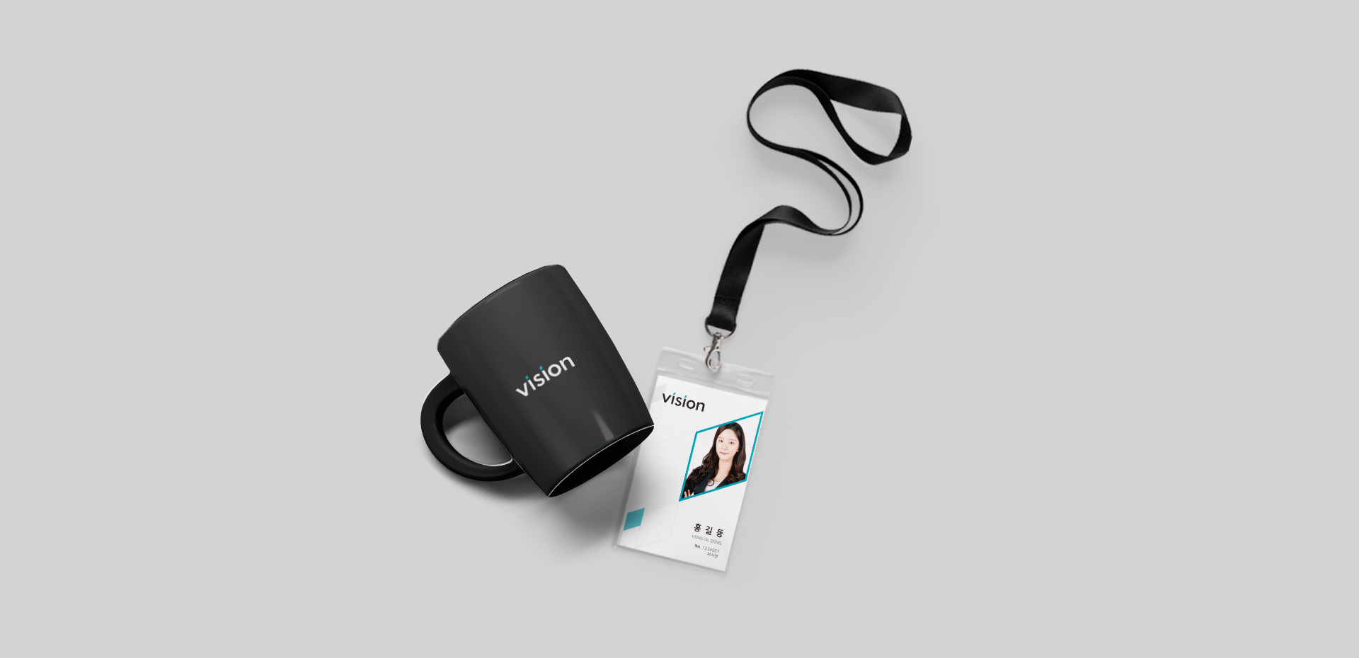
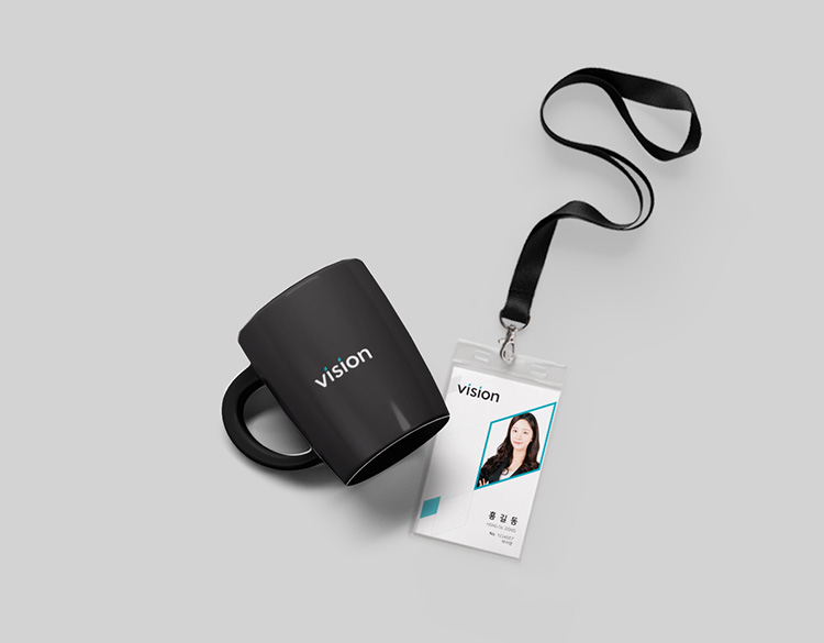
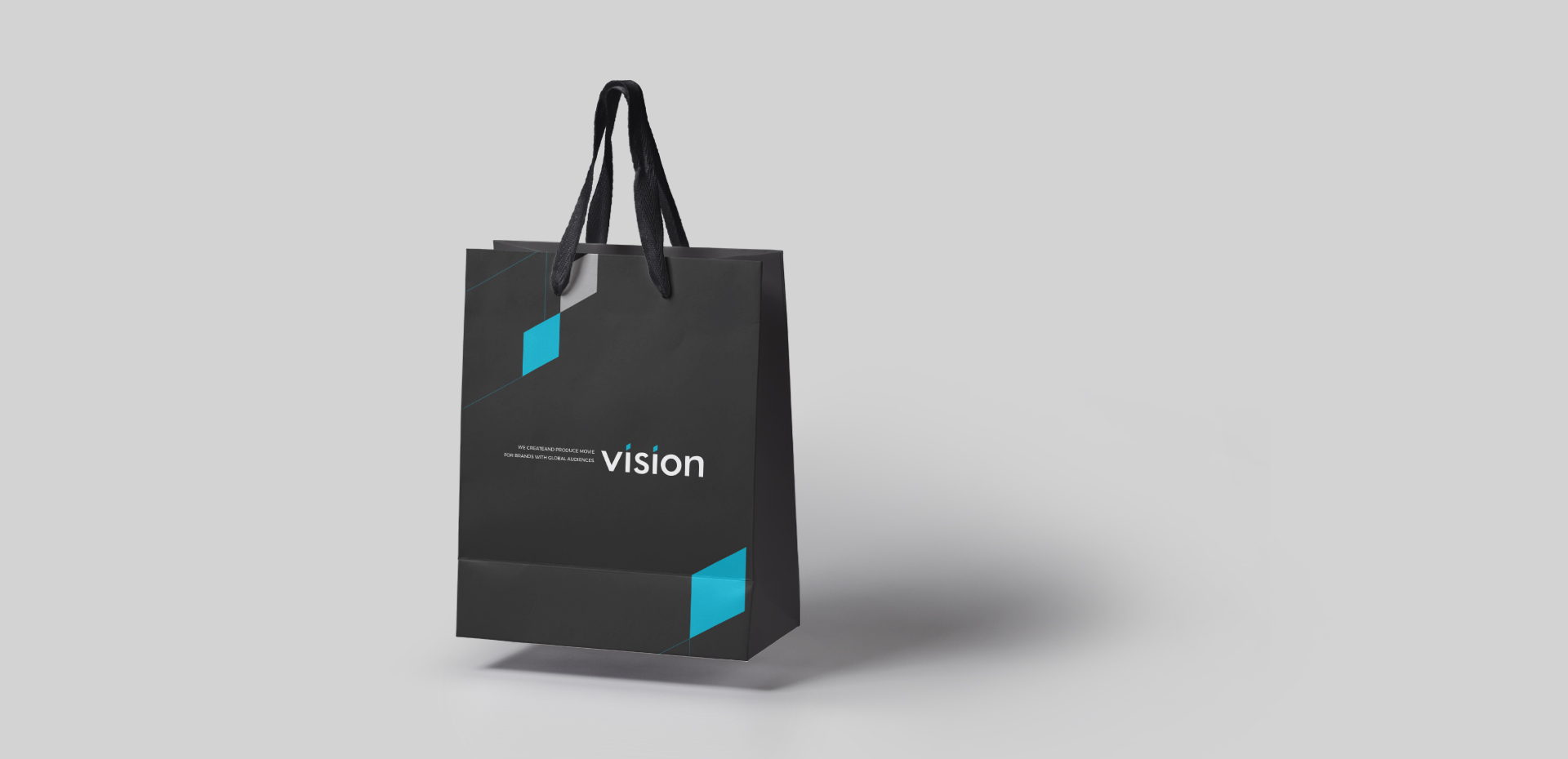
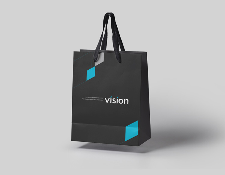
Application
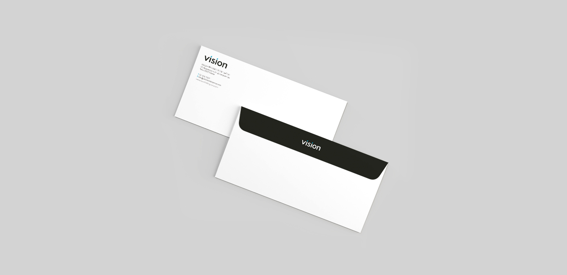
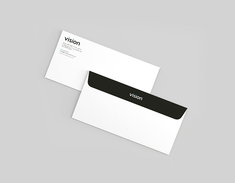
Small Envelope
Web design
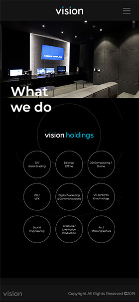
클라이언트와의 커뮤니케이션을 거친 결과
VISION의 30년 역사를 담아내기에 가장 적합한 것은
‘Reel’이었습니다. 동시에 VISION이 추구하는 가치를
심플하게 녹여낸 사이트를 완성하였습니다.
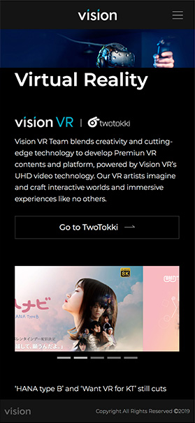
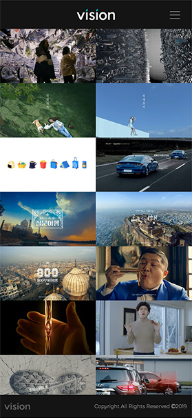
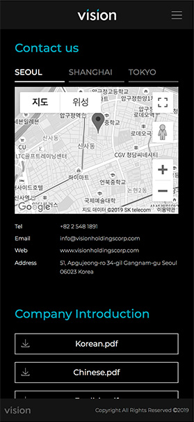
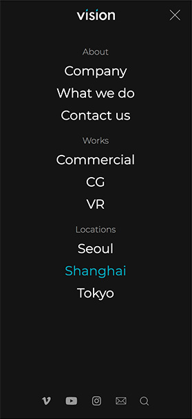
Mobile
사이트는 반응형으로 제작되어 웹의 구성이나
톤앤매너에서 벗어나지 않고
아이덴티티를 유지/강조하였습니다.